As a retailer in the 21st century, you’ve most likely felt a certain pervasive sense of dread. Whether you compete with e-commerce or split your business between the real and the virtual, it can feel like there’s no future in the real-world side of selling. But to paraphrase Mark Twain, the rumors of brick-and-mortar retail’s death have been greatly exaggerated. Sometimes, customers can’t buy everything they want online. Other times, they simply prefer not to buy online and truly want to step into your store. Either way, your small business still has one foot in all three dimensions of the real world, and here at ChromaLabel, we’re grateful for that. You surely know, as both a customer and a retailer, that there’s no substitute for seeing the products you want outside the cozy confines of your device’s screen.
So again, congratulations on doing more than running a mere warehouse. But there are responsibilities that come with operating on real square footage for real human beings. When people make the decision to go out and shop non-virtually, they have certain expectations. They expect a space that is clean and appropriately illuminated; they also expect friendly and dedicated service from the staff. But perhaps most of all, they expect a store that is accessible and intuitively designed—even in the warmest and most welcoming retail spaces, customers want to walk in and find what they’re looking for. You, as a retailer, have to fulfill these expectations, or else the demise of brick-and-mortar retail will catch up to you sooner than you think.
ChromaLabel, don’t forget, is in the business of catching eyes. As a leading provider of vibrantly colored labels of all shapes and sizes, we don’t just understand the importance of visual appeal in the marketplace—we bring visual appeal into the marketplace. Since 1976, our products have applied bursts of color to retail shelves, and we want you to make the most of those bursts with floor plans and aesthetic sensibilities that best feature your products and keep shoppers coming back. Let’s talk about what not to do. Here are some common store layout mistakes to avoid as you prepare to welcome customers to a brighter, smarter, and more colorful sales floor.
Bad Lighting
Before we even lay out the aisles and stock the shelves, let’s take it from the top—the ceiling, that is. Proper lighting is integral to a retail experience. Lighting should set a mood for your customers, highlight your inventory, and make wayfinding easier. Though fluorescent tubes are the standard, there’s no one-size-fits-all approach to retail lighting. The bright lighting that works for a corner drugstore may be too garish for your candle shop or your clothing boutique. If you sell arts-and-crafts supplies, dim and warm lighting may make it too hard for shoppers to make sure they’re buying the right colored paint. Give serious consideration to what style of lighting is appropriate for your business and illuminate accordingly.
Narrow Aisles
We know that every square foot counts when it comes to retail. After all, you don’t want to waste the space you’re renting. But there’s a fine line between maximizing your space and cramming so much in that your space isn’t usable. Many retailers want their shops to showcase as much inventory as possible—they don’t want customers to think that their options are limited. But what’s more limiting than aisles no one can navigate? Don’t neglect to give breathing room.
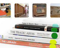
Not Marking Sales Items
All inventory is not created equal. You’ll always have products you’re looking to highlight, such as new releases, sale items, or inventory you’re looking to clear out. While shoppers may appreciate finding the newest of the new in your store or enjoying the pleasant surprise of a markdown at checkout, what you really want is to inform your customers while they’re shopping. Signage and labeling are key here. Vibrant colors draw attention, and a well-applied splash of color to a package or to the shelf will help customers find featured items. Signs at or just above eye level can draw customers to the general area, while colored dot stickers on or near items can denote special offers or items of interest. Low prices look good, but they look even better on a backdrop of eye-catching color.
Disorganized Inventory
Garage sales are wonderful one-off opportunities to find things you need, things you never knew you needed, and all-around steals of deals. But if your customers wanted to go to a garage sale, they would go there, not your place of business. Don’t let inventory be poorly displayed, with customers rummaging through piles to find what they need and leaving even worse situations for the next guests. There are fewer worse ways to alienate customers for good than with messy stores. For instance, digging through a pile to find a sweater doesn’t just inconvenience the shopper, it also makes them think they should be paying pennies for what they discovered in a heap.
Nonmatching Fixtures
Just as important as the quality of the inventory is where it’s displayed. Shelves, racks, tables, and anywhere else you display your wares should match as best you can, especially next to each other. Every store doesn’t have to be a model of Scandinavian minimalism, but the visual effect of mismatched shelving can be very jarring and suggest a high level of disorganization. If you do have display units that don’t match very well, make a point not to put them in proximity to each other.
Unoptimized Checkouts
Among the common store layout mistakes to avoid, one of the most important to avoid is the one at the end: the checkout. This is a place where you should be making one last push with bright, vibrant attention-getters, embracing colored labels to induce last-minute impulse buys. And of course, you want your customers to find your checkout counter easily, too. A well-designed checkout is a customer’s final impression of their shopping experience, and you should make it the best it can be; that’s how you get people coming back.
Even in the best of times, retail is a tough industry for small businesses. But with these tips in mind, we hope you can do your best and make the most of your space, inventory, and the people who make it all work—with a touch of colorful assistance, of course, from the vibrant offerings of ChromaLabel.
Update from April 2021
We have several products available to help your business. Here are the products we recommend to help you keep your store organized and looking great!
Custom Labels give you the option to customize the size, shape, color, design and texture! These can add some brand recognition to price tags or signage. Black printable labels work great for barcodes, price tags, or product information. Dot stickers work great for inventory management. Available in a variety of sizes and colors. They also come in both removable or permanent adhesive.
Have questions about which products are right for you? Give us a call and we will be happy to help you! (800) 256-0435