(Organization: Simple Ways to Boost Office Efficiency Part 2)

Back to the Basics
Most want their company to succeed; there’s no doubt about it. Efficiency is everyone’s best friend in the workplace. The more you can eliminate actions, the better your efficiency becomes. However, working at maximum capacity all the time doesn’t translate to high efficiency. In fact, it greatly increases the chance of burn-out. There is a balance that needs to be struck between production and maintenance. For instance, a car gets you from Point A to Point B, but if you never stop to give it the oil change it needs, then eventually it shuts down.
Stay on top of your game
It’s easy to get hung up on doing things the way they were always done, however, the old way isn’t always your best option. It’s essential to stay on top of things and look for ways of optimizing your system. It might go without saying, but organizing is the epitome of the phrase “work smarter, not harder.”
3 reasons to Color-Code
One of many ways to professional efficiency is by using a color-coding methodology.- Color helps to process information at a glance, even showing priority and helping catch mistakes that would go unnoticed in a sea of words.
- When used well color breaks up the monotony of boring situations making employees more productive and at ease, possibly even happy, sunny and bright.
- Color Coding not only keeps the office organized but also speeds up a trainee's learning and retention because color helps us recognize patterns more quickly.

Process Information Faster
Color-Coding with purpose
There is a fine line between color-coding and adding random colors to things just because you were lucky enough to be ‘cuckoo for cocoa puffs’ that morning. Color-Coding takes planning but at the same time, it is a fun process that ultimately pays dividends for your workplace. Color-Coding in a tasteful way makes it easier to process information. It’s the same concept of underlining or highlighting text in a book. You call your attention to that portion of text because you know that color is signifying something specific.
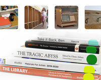
By color-coding, you are taking a monochrome medium and adding a distinct variant that signifies one thing; this makes it fast and simple to identify that variant in a dataset. As an example, having 7 identical black notebooks for school can be a struggle, because you run the risk of not quickly locating your History notebook before the teacher starts class. However, different colored notebooks make this problem practically non-existent.
Office Design and Color Psychology
There is something poetic about an empty space. Like a blank canvas, an empty room is filled with potential. It may be architecturally designed towards a specific use, but the details are open for you to decide. Interior design may not be the foremost thought when you talk about an office, but design choices do make a profound impact on the productivity and efficiency of your team. The way you furnish that workspace sets the tone and mood for every employee every single day, year in year out.
Color psych ology shows that color has a tremendous effect on the subconscious mind. The color yellow can trigger an emotional response of warmth, happiness, energy or attention. This is why a road sign like a school zone crossing will be in yellow; because it calls attention to itself without necessarily invoking a feeling of hazard. The brain is constantly processing vast amounts of information, and colors are incorporated into everything we see. Surely with all this exposure to different colors, we begin to associate color with other facets of our lives.
Research has been done concerning the effect of various color schemes in public places. One study states that “The color of our surroundings can both create stress and ease the stress[es] in life.”
Moreover, this study states, “The skillful use of color can help overcome the sensory deprivation caused by lack of visual stimuli associated with drab or monotonous environments.” (Ibid.)
Distraction from distraction
If you are sitting at a restaurant waiting for your food, and there is a pamphlet or special’s menu, you may catch yourself fidgeting with it subconsciously. If it has a few pictures on it, there is a good chance that you will start studying it ––at least enough to see what it is and what it says. These visuals are calling out for the attention of your subconscious. Almost everyone will, at least, glance at it before they dismiss it. In an office, fidgeting doesn’t help your productivity but at some point in the day, you are bound to catch yourself doing it.
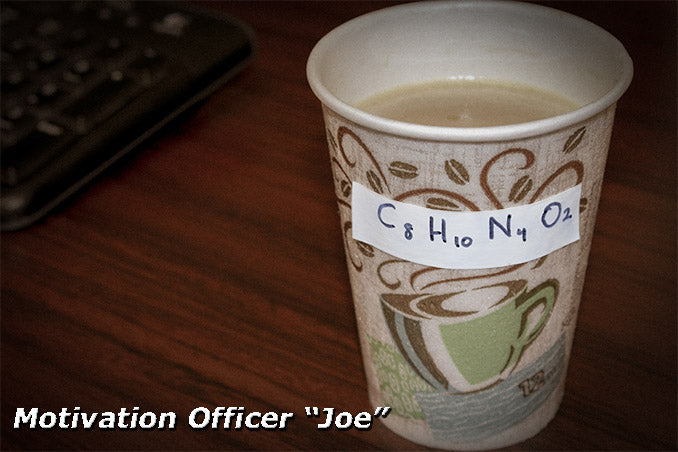
Whether we want to admit it or not, there is a point where distraction is not only tolerated but even welcome. Staring at spreadsheets (in all their monotonous glory) can drain the life out of you after an hour or two. However, you can "build in" distractions for yourself that keep you from inevitable boredom. Little things like adding a color scheme to your assortment of sticky notes, or labeling your coffee cup with some dry humor can go a long way.
Expedite Training with Color
This may seem like a stretch, but color-coding does help new employees learn more quickly. If you give Devlin, the trainee, a list of tasks to accomplish it is not uncommon for him to feel overwhelmed. It takes trial and error to understand what things have a greater priority. Edvard, the trainer, can spend a lot of time explaining the system or he can assign a color to higher priority projects. This way the learning curve of Devlin is tackled efficiently.
For instance, in a restaurant, a new cook needs to learn an entire menu very quickly and have nearly everything memorized within a few weeks. This task is much easier when someone breaks down the menu in chunks. Certain dishes are ordered a lot, so these need to be memorized right away. That way the new sous chef is more of a help than a hindrance to the executive chef. Other more obscure menu items can be put on the back burner for a week without causing problems.

ChromaLabel Shares its Color-Code System
We previously promised that we would explain how ChromaLabel organized its office. We hope that these protips help in your office.
We prefer the phrase ‘passionate for pigment’
As a Color-Coding Resource, you may have guessed we like our happy hues, and we take them very seriously. It’s a rare week that you don’t hear about Pat’s musings on Apricot or Chartreuse. We’ve got different colored pens, highlighters, post-its, even our spreadsheets can’t escape from a tasteful palette of pigment. Each week is assigned a color, and each task is labeled according to the week of its deadline. That way all our tasks are prioritized and accomplished on time. We don’t consider ourselves ‘crazy about color’, however, if you’re not in the color industry, you may find our behavior a bit eccentric. If truth be told, Frank (our resident nay-sayer, truly deserving of his name) may agree with you.
It’s not what you say...
 It’s possible to artificially slap a color on something and then proclaim, from that day forth, invoices will be labeled with a Burnt Umber dot sticker. My instinct is to cringe slightly at this, but if the system works then fair enough.
Another effective way is to associate the color to its function organically. As an example, invoices possess a sense of urgency by nature. A vivid fluorescent color may prove highly effective for organizing them in an efficient way. You could file them with Fluorescent yellow, orange, and red to denote the lateness of the bill. Once the bill is paid a cheery green dot can quickly show that you received your hard-earned cash.
This style of color-coding makes it even easier for new employees to recognize patterns in your system and ultimately helps them work on a more productive level much faster.
3 Steps for Organizing your Office
Step 1: Know the goal
First and foremost, assess what you are color-coding. This will nail down what size you will need. If you are labeling boxes in your warehouse you will likely need a 3” dot, but that dot is a little big for the standard 8.5” by 11” paper. If you don’t want to invest in multiple sizes but more colors then we recommend using ¾” for any of your smaller items and 2” for larger items. ChromaLabel uses ½” or 3⁄4” dots to label manilla file folders in order to prioritize and organize our file cabinets.
Step 2: Label logically
We found that color-coding tape is perfect for labeling cabinets and shelves. Color-Coding tape has a strong adhesive bond that will stick well to the shelf while still being removable. ¾” was the perfect width because it was small enough to fit on the edge of the shelf, but still large enough to write on with a Sharpie.
Although color-coding tape can be torn by hand we suggest using a ruler and a pair of scissors to ensure a crisp straight cut at an exact 90° angle. Our philosophy is if it’s worth the time to do something, it’s worth the time to do it well. It may seem like a little thing but something so simple adds a very impressive air of professionalism.
Be Careful: Permanent is permanent!
You could use and RCR or Round Cornered Rectangle Label for this task, however, we do warn that you proceed with caution, because we aren’t joking when we say that they are permanent. It will take quite a bit of effort to remove it and in the process, it will likely damage the finished surface you place it on. This is why we generally suggest using removable dots and color-coded tape just in case you want to change your mind.
Step 3: Stick with it (pun definitely intended)
If you are going to take the time to re-organize your workspace, keep in mind that things are constantly changing. Your system needs to have the ability to adapt to different situations. For instance, you have probably never heard of the color Marsala. That is completely understandable, but in late 2014, Pantone projected that this color would be a huge hit in the upcoming year. If you decided to jump on the Marsala train you may find that this color isn’t the most popular a few years down the road. Our 38 Collection is a fairly timeless set of colors. It’s a large selection of classic colors, but they are not obscure colors like Marsala and Living Coral.
Hopefully this gave you some new ideas to bring to your workplace. Chromalabel can help you get organized and stay efficient with tons of different products. Feel free to call us and let us know what your organizational goals are, and we will be happy to help you pick out the right product!
Update from April 2021
Just like you, we update our color coding and organization process to keep up with the changing work flow in the office. You may find that the 1" red dots no longer fit what you need, but luckily, there are tons of options at Chromalabel, in every size and color! We have a product for all of your organizational tasks and can always customize labels for something specific you need!